There are two types of patterns traders could use when analysing the market: price action, chart patterns, and candlestick patterns.
First, we will cover the various aspects of chart patterns before moving to candlestick patterns.
Chart patterns in price action
Chart patterns became synonymous with price action because technical traders believe the market isn’t random and certain patterns tend to repeat themselves.
Chart patterns form due to a struggle between buyers (bulls) and sellers (bears) or a change in supply and demand.
These patterns could assist traders in making more informed decisions on where the market could move. The result of the pattern will generally dictate which direction the trend will move, either upwards or downwards, depending on the pattern formation.
However, traders might want to look out for a false breakout. This is a false signal, trapping traders into thinking the market will move in their desired direction, only to reverse shortly afterwards. These false breakouts can appear as a bull trap or a bear trap.
Different chart patterns move in different directions depending on the prevailing trend at the time. In contrast, the formation of these patterns will differ depending on the situation between buyers (bulls) and sellers (bears).
Each outcome will vary depending on certain factors, such as whether the market is experiencing high or low volatility.
Lastly, there are many different chart patterns to choose from; however, each will fall into one of three categories: continuation, reversal, and bilateral.
- Continuation patterns: These patterns indicate that the market is likely to continue with the current trend once the pattern's result has been reached.
- Reversal patterns: These patterns indicate the market is likely to reverse from its current trend following the result of the pattern.
- Bilateral patterns: These types of patterns are a little trickier because they indicate indecision in the market, meaning the pattern result could either show a continuation of the trend or a reversal.
For the purpose of this article, we’ll only be covering continuation and reversal patterns in more detail below.
Trend continuation patterns
Trend continuation chart patterns generally indicate that the market will continue its current trend.
These patterns form because buyers are taking a break from finding lower prices to buy while the market is in an uptrend. Conversely, when these patterns form while the market is in a downtrend, it indicates sellers are taking a break from finding higher prices to sell.
It can be challenging to predict what will happen as the pattern starts forming, so it might be best to wait for the pattern’s result before deciding to enter a position.
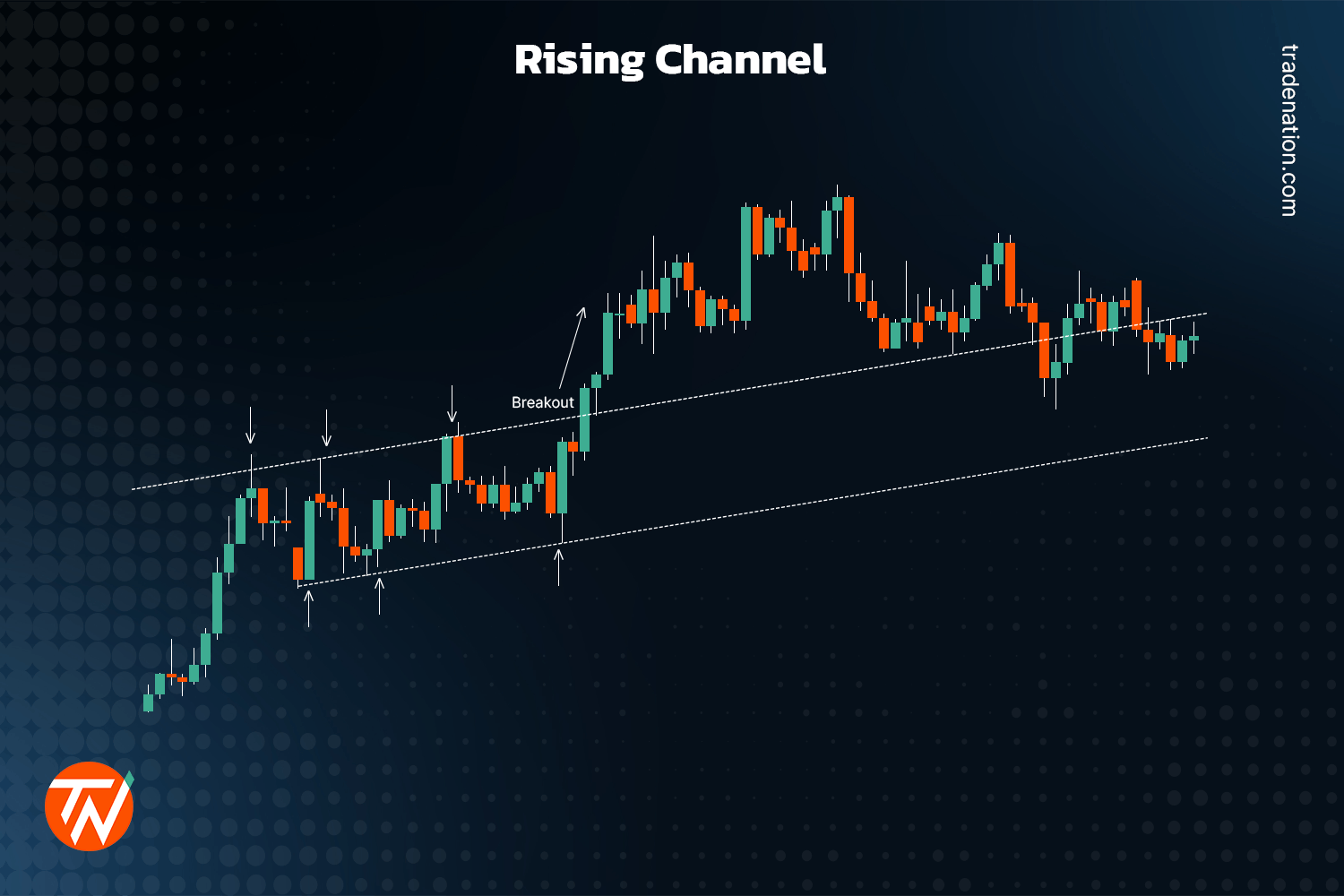
As previously mentioned, traders can choose from many different chart patterns. Two popular continuation patterns are channels and flags.
Channels are formed when prices move between two parallel trendlines, with the top trendline acting as resistance and the bottom trendline acting as support. They can also occur in bull markets and bear markets.
This pattern forms because buyers take a break when the market is in an uptrend, and sellers take a break when the market is in a downtrend.
The way to identify this pattern is when the price moves sideways with a slight slant to the upside when the market is in an uptrend. The pattern formation will be the same for a down trending market, except with a slight slant to the downside.
The way to trade this pattern could be for traders to wait for the price to break out of either support or resistance, depending on the dominant market trend, before placing a long (buy) or short (sell) order.
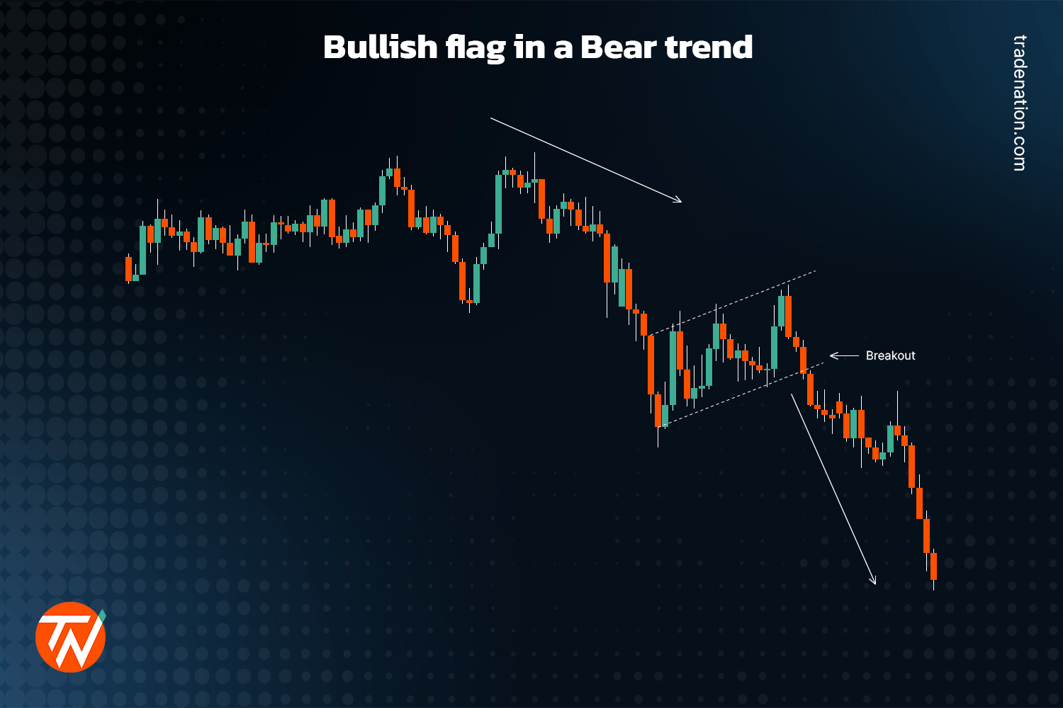
When it comes to flag patterns, the formation is also identified by two parallel trendlines; however, in this instance, the price will either slope downward when the market is in an uptrend or upward when the market is in a downtrend.
When the market is in an uptrend, the pattern is created, with buyers taking a break and sellers starting to come in, pushing the price lower. At some point, buyers will start to come in again, causing the price to break out of the top trendline (resistance) and the market to continue with the overall uptrend.
Conversely, when the market is in a downtrend, the pattern is formed due to sellers taking a break and buyers coming in, pushing the price higher. At some point, sellers will start to come in again, causing the price to break out of the bottom trendline (support) and the market to continue with the overall downtrend.
Trend reversal patterns
Reversal patterns emerge when market sentiment shifts. These patterns generally indicate that the dominant players, whether bears or bulls, have run out of steam.
If the market is in an uptrend accompanied by bullish excitement, where buyers feel the price will continue to rise, the market can always stall when it reaches a certain point.
When it gets to that point, sellers could start coming in, causing a “tug of war” between buyers and sellers where the sellers ultimately take over, pushing the price lower, resulting in a reversal.
The same can be said for when the market is in a downtrend and stalls at a certain point when buyers start coming in, pushing the price higher and reversing upwards.
Reversals at these market peaks are also known as distribution patterns, where the financial instrument has more selling pressure than buying pressure.
On the other hand, reversals occurring at market bottoms are known as accumulation patterns, in which a financial instrument experiences more buying pressure than selling pressure.
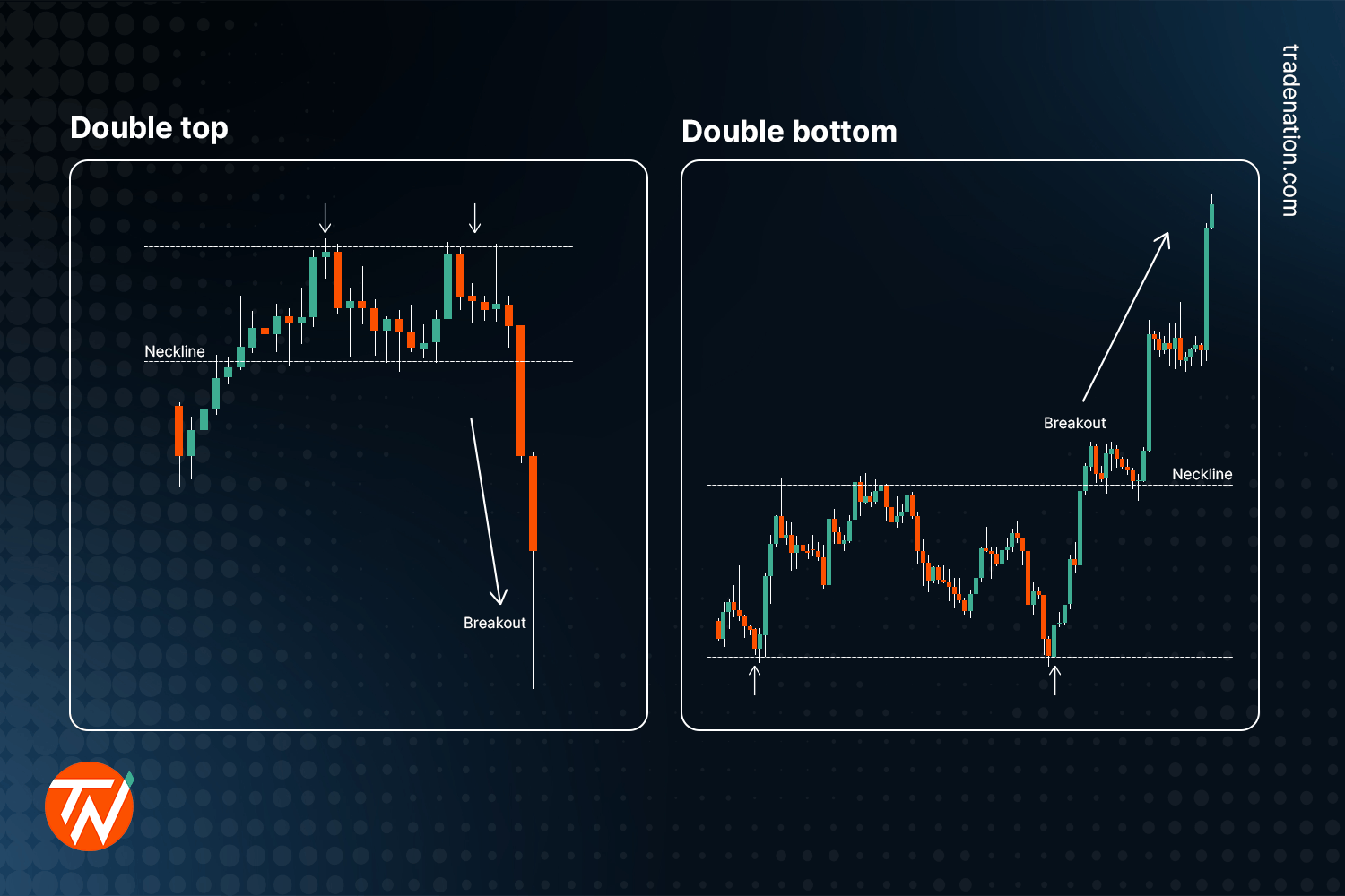
One of the more popular reversal chart patterns used by traders is double tops and bottoms. A double-top pattern shows an instrument’s price trying to break out above the previous high point at a resistance level but failing, resulting in a possible reversal.
The two high points in price are almost identical in height.
The retracement from the first high can be seen as a support level known as the neck. Traders could wait for the price to come down from the second high, and when it breaks the support level, it could confirm that the price will likely reverse into a downtrend.
A double bottom is the opposite of a double top, where the price fails to break the previous low point at a support level, resulting in a reversal.
The two low points in price are almost identical in depth.
The retracement from the first low can be seen as a resistance level known as the neck, like the support level in a double top.
With a double bottom, traders could wait for the price to move up from the second low point. When it breaks above resistance, it could confirm that the price will likely reverse towards an uptrend.
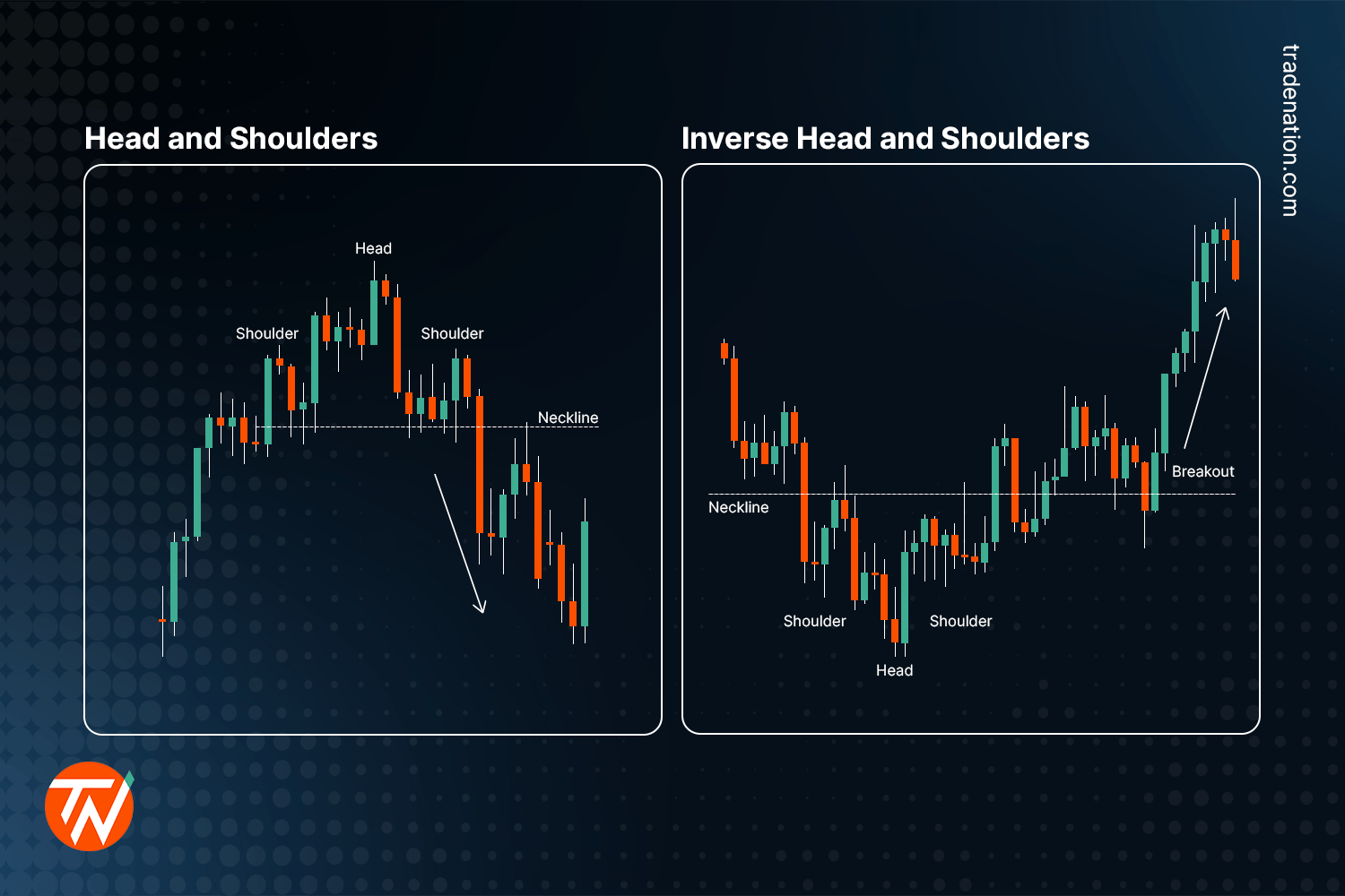
Another popular reversal pattern traders use is a head-and-shoulders pattern, which could appear during a market uptrend. Its formation is identified by its three peaks.
The first peak refers to the first shoulder, the second, higher peak refers to the head, and the third peak, which is more or less the same height as the first peak, refers to the second shoulder.
During the formation of this pattern, the two retracements will generally retest the same support level, known as the neckline.
For a trader to confirm the reversal with this pattern, they could wait for the price to move back down from the third peak towards the support level; if it breaks out below the support level, that could be confirmation the price has reversed and will likely continue the new downtrend.
There is also the inverted head and shoulders pattern, which could appear during a market downtrend.
This pattern's formation will resemble a regular head-and-shoulders pattern; however, it will be upside down. Also, the neckline will be situated at a resistance level instead of support.
With the inverted head and shoulders pattern, traders could wait for the price to rise from the third peak, moving towards the resistance level and waiting for a breakout above resistance. When that happens, it could be confirmed that the price has reversed and will likely continue with the new uptrend.
During the formation of either of these head and shoulder patterns, the volume will likely decrease, rebounding once the price breaks out of the neckline.
Candlestick patterns in price action
Before identifying and assessing whether a candlestick pattern is reliable, a trader might want to wait for the current candle to close first. Once the candlestick has closed, they could examine the high, low, open, and close points together with the colour.
Waiting for the candle to close first before identifying a potential pattern might be essential because, depending on the timeframe a trader uses, the price can move between a bullish (green or white) and a bearish (red or black) candle during the specific time interval.
There are many different candlestick patterns traders could use. However, they all fall into one of three categories: bullish, bearish, or continuation patterns.
In the following few sections, we’ll look at two bullish candlestick patterns, two bearish candlestick patterns, and one continuation pattern.
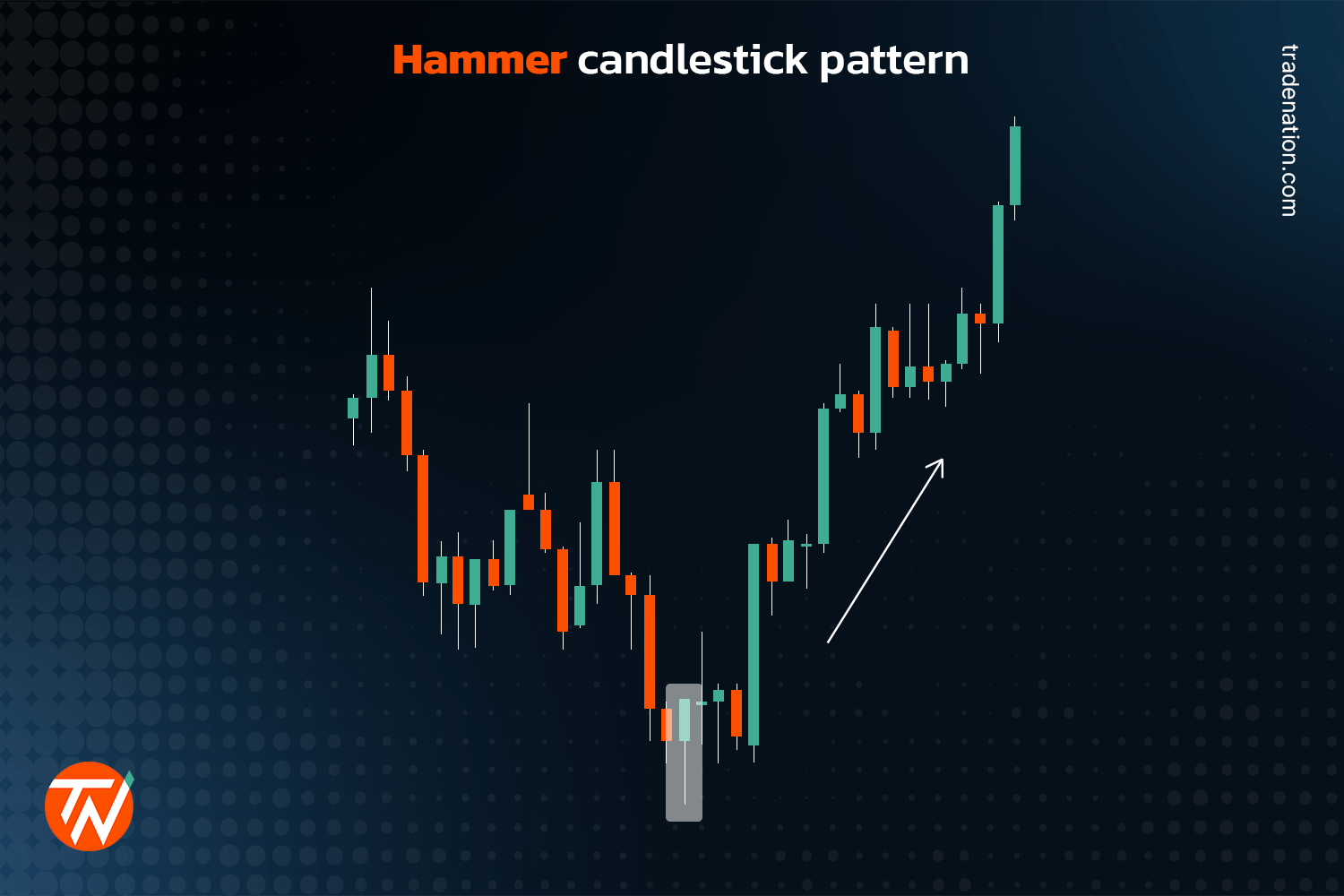
Hammer
The first candlestick pattern is the hammer, characterised by a small body, a long lower wick, and little to no upper wick. For a candlestick to be considered a hammer, the wick must be at least two to three times the length of the body.
This pattern is formed due to exhaustion when the market is in a downtrend and signals a possible bullish reversal is likely to follow. Sellers drove the price to a new low during the trading interval but couldn’t maintain it. Instead, buyers came in, pushing the price higher, which caused the price to close just below or just above the opening price.
If the candle closes just below the opening price, the colour will be red or black. However, if it closes just above the opening price, the colour will be green or white.
Generally, the candle’s colour isn’t as important as the pattern itself; however, if it is green or white, it can be seen as a stronger signal.
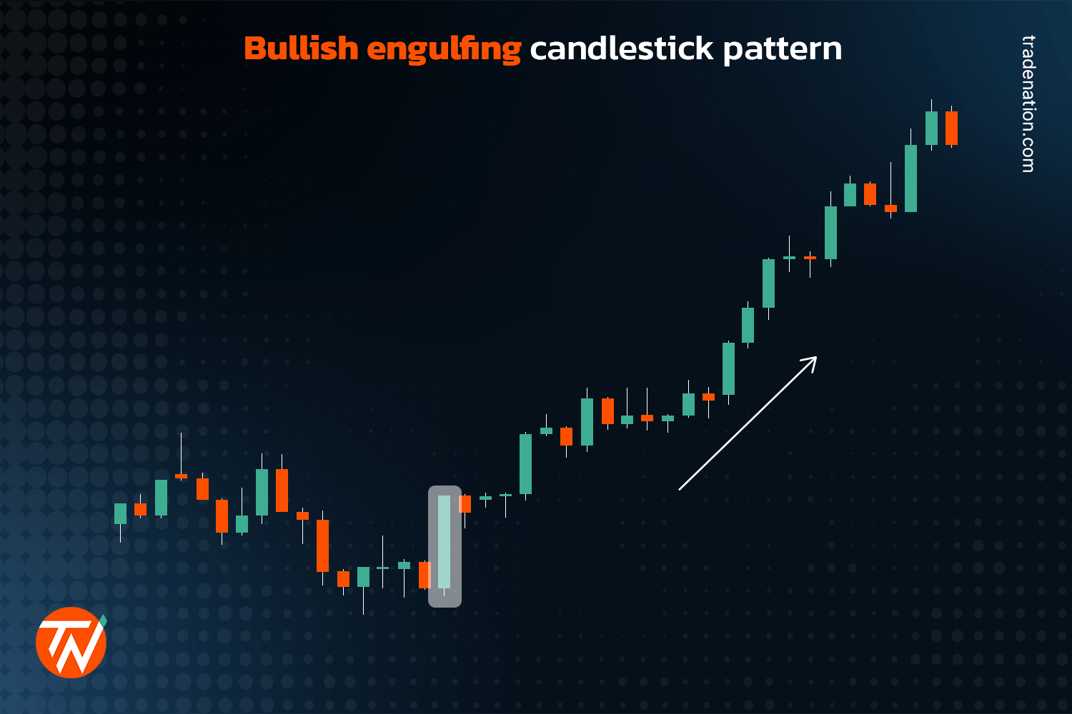
Bullish engulfing bar
A bullish engulfing candlestick pattern is a combination of two different candles, with the first being a red or black bear candle following the downtrend and the second being a green or white bull candle.
The formation of the bear candle isn’t of much importance; what is essential, though, is the next green or white bull candle that follows, which completely engulfs the previous bear candle.
When this happens, it indicates that buyers came in strong and overwhelmed the sellers. The candle starts at the closing price of the previous candle but eventually rises past the prior candle’s high before closing.
As the price concludes at or near the top of the bull candle, barely declining, there should be little to no apparent upper or lower wick.
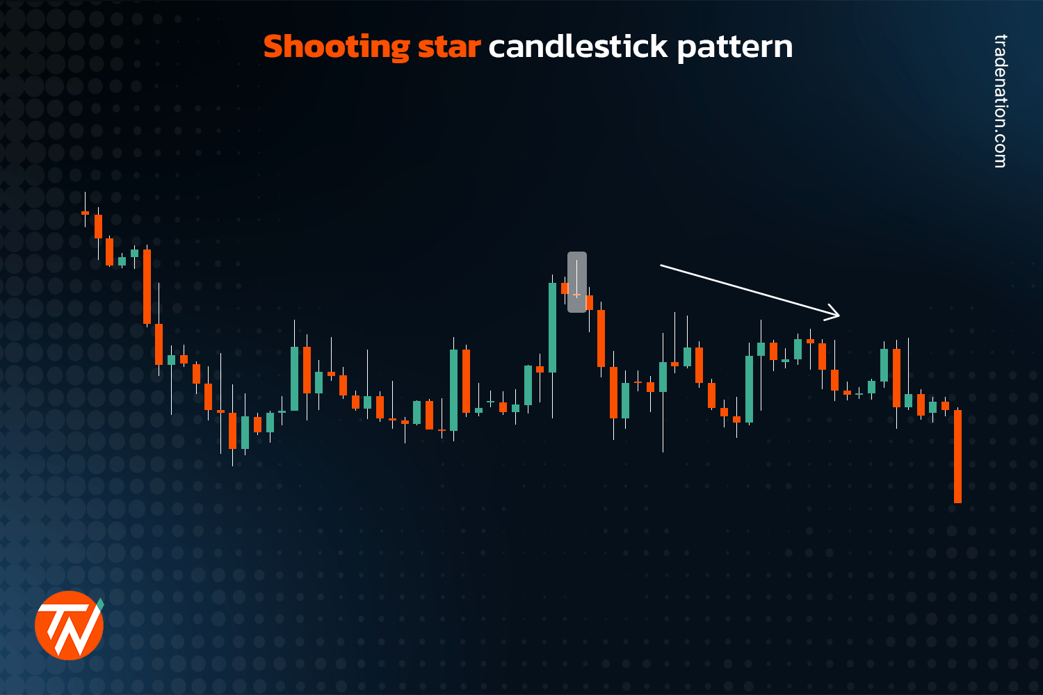
Shooting star
A shooting star’s formation looks like an upside-down hammer pattern and becomes significant when the market is in an uptrend. Instead of the candle body being at the top, with this pattern, it appears at the bottom, with a long upper wick.
Much like the hammer, the wick of a shooting star should be two to three times the length of the body to be considered a shooting star.
This pattern is usually formed when the price experiences exhaustion while in an uptrend. Buyers push the price higher. However, sellers come in, overwhelming the buyers and pushing the price lower, causing the candle to close near the opening price point.
This pattern could signal a possible bearish reversal is likely to follow.
Again, the candle’s colour isn’t critical; it has more to do with the pattern itself. However, if the candle is red or black, it could be seen as a stronger signal.
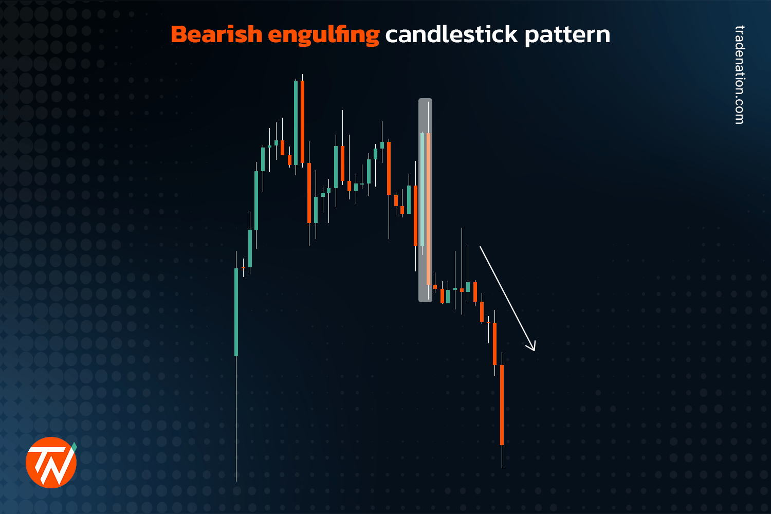
Bearish engulfing bar
A bearish engulfing pattern is the opposite of a bullish engulfing. It is also a combination of two different candles, the first being a green or white bull candle followed by a red or black bear candle, which is significant when the market is in an uptrend.
Again, the formation of the bull candle isn’t very important. However, the next bear candle is essential, as it completely engulfs the previous bull candle.
When this happens, the candle opens at the previous candle’s closing price when sellers start coming in, overwhelming buyers and causing the price to fall below the prior candle’s low point before it closes.
As with the bullish engulfing candle, when the price concludes at or near the bottom of the bear candle, barely rising, there should be little to no apparent wicks on either end.
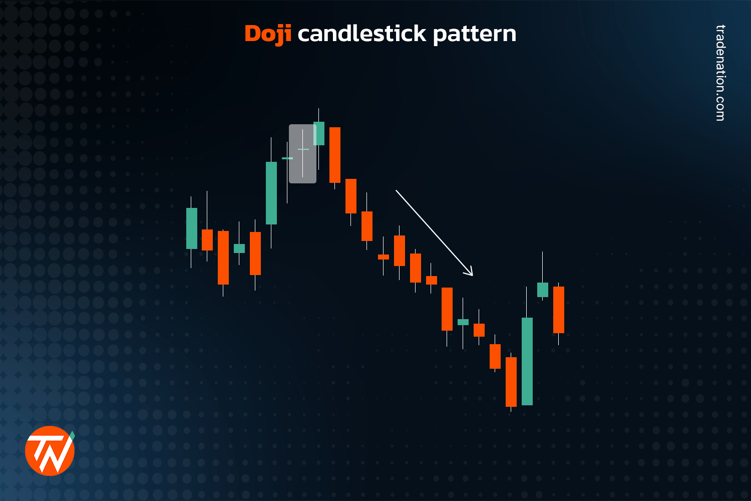
Doji
The last candlestick we’re looking at is a continuation pattern. A doji candlestick pattern is easy to identify because it resembles a big plus sign with a small to non-existent body. The open and closing points in price are almost the same.
The wicks on either end could vary as the vital part of this pattern is the small to non-existent body. This pattern forms because buyers and sellers struggle, with no one coming out on top.
The doji candlestick pattern indicates indecision in the market, and as a result, the current trend might continue after this pattern is formed.